If you are working in microbiology and usually do growth curves, this is a topic for you.
I worked with growth curves during my working time. I have done this on 96-well plates and gotten a lot of data points. I saw some people copy and process those data types with Excel and GraphPad. It is terrible for me!
For Candida auris, I measured every hour for at least 2 days which is not able to plot manually with MS Excel or GraphPad. Therefore, preparing some R scripts for data processing and visualizing is make sense.
1. Prepare your data
When you get data from the plate reader, it is in CSV or excel formats. You need to name your files by the same pattern with different time points, we will extract the number for plotting later. All data files are put in the same folder.

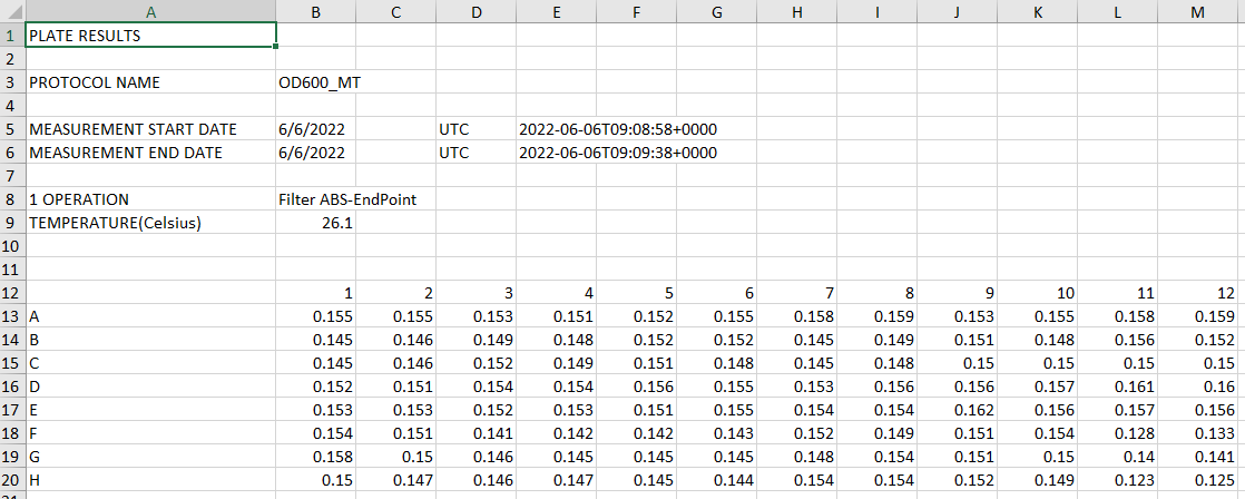
I guest your data from the plate reader will look like below with 96 data points.

2. Import your data into R and transform it into the long format
#call library
library(tidyverse)
library(reshape2)

#get file name
#change pattern following your file names
listFiles <- list.files(pattern = "mBioRev_GR_*")

#read data from excel into long data and annotate the data
listData <- lapply(listFiles, function(x) { #read all data into a list
  df = melt(readxl::read_excel(x, #use melt() from reshape 2 to make long data
              range = "A13:M20", #select your data region
              col_names = c("row", seq(1:12))), #add column names from 1-12
              value.name = gsub(".*_(.+)h.xlsx", "\\1", x),
              variable.name = "col")
  df$ID <- str_c(df$row, df$col) #generate an ID column from row names and column names. Result of ID should be A1-H12
  df<- df[,c(4,3)] #select ID and OD value that we need
  })
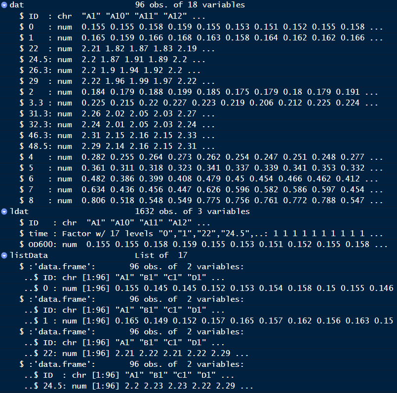
After this step, each file will be an element of listData, you need to convert listData into data frame.
#convert list to dataframe
dat <- Reduce(function(x,y) merge(x=x, y=y, by="ID", all=T), listData)

#transform into long data
ldat <- melt(dat, variable.name = "time", value.name = "OD600")

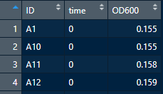
Your final result should look like below

3. Load metadata
Prepare metadata for your 96-well plates.
- for medium

- for strain list

#load metadata into R and anotate
meta_medium <- readxl::read_excel("meta.xlsx", sheet = "medium",
                   col_names = c("row", seq(1:12)), skip = 1)
meta_medium <- melt(meta_medium, id.vars = c("row"), value.name = "medium") #transform into long format
meta_medium$ID <- str_c(meta_medium$row, meta_medium$variable) #generate ID (A1-H12)
meta_medium <- meta_medium[,c(4,3)] #select essential columns

#do similar for strains
meta_strains <- readxl::read_excel("meta.xlsx", sheet = "strains",
                                  col_names = c("row", seq(1:12)), skip = 1)
meta_strains <- melt(meta_strains, id.vars = c("row"), value.name = "strains")
meta_strains$ID <- str_c(meta_strains$row, meta_strains$variable)
meta_strains <- meta_strains[,c(4,3)]

#merge metadata from strains and mediums
meta <- merge(meta_medium, meta_strains)
4. Join your data with meta
#Join data
pdat <- merge(ldat, meta, all= T)
5. Visualize data
#call library
library(ggplot2)
library("ggsci")

#check your data structure first to make sure numeric value of time and OD
str(pdat)

#convert to numeric
pdat$time <- as.numeric(as.character(pdat$time))

###plot for each medium
p <- ggplot(data = pdat[pdat$medium=="YPD"&pdat$strains!="control",],
       aes(time, OD600, col = strains)) +
  geom_point() +
  geom_smooth(se = FALSE,alpha=0.5, span = 0.3) +
  theme_bw() +
  scale_color_npg()  + #set nature journal colors
  theme(text = element_text(size = 20), legend.position=c(0.8, 0.4))

#Saving as svg
svg("YPD.svg",                      # File name
    width = 8, height = 7)          # Paper size
#plot name
p
# Closing the graphical device
dev.off()
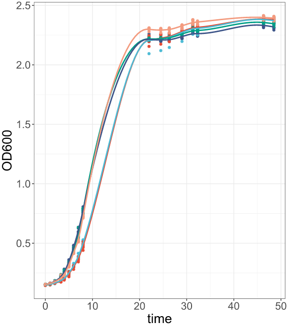
Your result should look like the figure below
